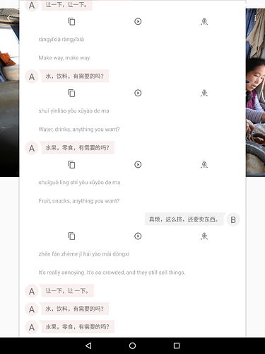
It’s it possible to have the Android app layout a little clearer on the dialogue tab? When you open each line of dialogue to view the pinyin and English translation, there are tool icons in the way. This separates the hanzi from the pinyin and English and makes it difficult to follow. Is it possible to link the three together and have the tools as either a separate tab or even just below the text. Also, when the hanzi is right aligned, the pinyin and English are left aligned which makes it a little confusing.
@liamboyd @GwilymJames
Yea these are great suggestions. I’ll definitely put some thought into how we could improve the readability of not only the dialogue, but the other lesson modules as well.
Thanks for pointing this out Liam.

