Main Site Blog Help

Updates to ChinesePod website (April 2017)

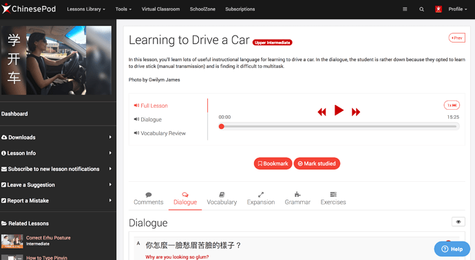
In the coming days, we will be updating the look and feel of the current ChinesePod website to match the look of our other products and apps.

The first update will be an aesthetic one, with improved colors and layout, to better display our lesson content.

Once this is done, we will begin implementing new features and improving how lessons are organized/discovered.

Feel free to leave your comments below on what you would like to see added in terms of features for the coming updates.

Which ideas are closest to your heart? Let us know in the comments.

Some ideas:

  • Pre-intermediate level to help jump the gap to intermediate
  • Floating audio/video player that scrolls down page
  • custom users playlists
  • custom user tags (to build lists of lessons)
  • Dashboard with most recent, studied lessons
  • Ability to mark vocabulary as “known” or “unknown” and give “% known” for each lesson
  • Upon hitting a lesson as ‘studied’ create a countdown timer for when it is due to be studied next.
  • custom fonts

Which of these sounds good. Any more ideas? Leave a comment.

3 Likes

Awesome! I like Pre-intermediate level to help jump the gap to intermediate &
Floating audio/video player that scrolls down page the most.

All of my learning is on my phone and in the car using the mobile site. Please keep the mobile site as it’s much harder to sort lessons chronologically and also by level using the app. Please keep the ability to list the lessons chronologically. I like to study each one in order without wondering if I missed one.

I’ve always wanted the option to play the translation portion of the lesson similar to the current ability to play the dialogue separately. At my stage of learning, it’s more helpful to listen to the slow dialogue with plenty of pauses and repeat the sentences to myself. The regular dialogue still is too fast for me and there’s no time after each sentence to repeat it and internalize it. I could review past lessons more easily if I could play only the translation portion. With the half-sped playback button, of course ;).

2 Likes

“Ability to mark vocabulary as “known” or “unknown” and give “% known” for each lesson”:
I think that would be very helpful. I find some intermediate lessons to be harder than some upper-intermediate lessons for me because I know more vocabulary in certain subjects. If I knew before hand, I’d know if I should read through the vocabulary list first or not. But if you do this, it would be helpful to have an “import” function to give the site a list of words I already know

“Upon hitting a lesson as ‘studied’ create a countdown timer for when it is due to be studied next”:
This could be good. Personally, I just put together 20 minute long dialogue play lists in iTunes, then put reminder cards to listen to each in my Anki, so I probably wouldn’t end up using it myself

1 Like

I would find “Floating audio/video player that scrolls down page” most useful :slight_smile:

1 Like

The new outlook is awesome & classy. I find some ideas for your consideration with regards to further future improvement/enhancement:

  1. Is it ok to integrate Traditional Characters in one transcript ? I think it will save some time during downloading.
  2. Is there any way to save some words that we have studied? maybe like Word Bank or something.
  3. Is the video downloadable? Hmm it would be nice if we can save it for review or incase we want to study offline.
    Thanks.

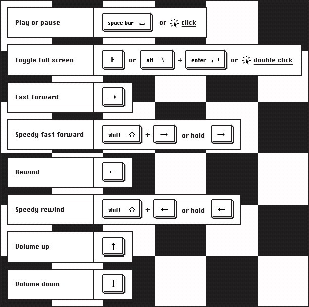
Please oh please have the video player either a) floating on the page or b) provide a hotkey to pause/play audio!

This will allow me to scroll down the page to read the dialog and adjust my listening as needed.

The new look site is awesome btw, along with most everything you guys do. 加油!

These would be immensely helpful:

-Floating audio/video player that scrolls down page
-Ability to mark vocabulary as “known” or “unknown” and give “% known” for each lesson

If you do implement the second one, it would be nice to create some means for more advanced students to “catch up” in logging their known vocabulary (which is one issue I have with Lingq). Perhaps a page that lists vocab by HSK, where we could rapidly go through the list and mark known words (or even mark whole HSK levels as “known”).

Also, offer “% known” not only as information but also as search criteria.

Yes, hotkeys would be nice. This is one thing I love about Youtube’s player. Left arrow brings you a few seconds back, right arrow brings you a few seconds forward.

The site is getting better and better with every update! The colour change of the left-hand sidebar makes the dashboard much clearer.

I’d like to see:

  • Floating audio/video player that scrolls down page

  • Custom user playlists

I would also like to suggest a couple of design-based things about the site:

  • Would it be possible to make the ‘bookmark’ and ‘studied lesson’ icons a little clearer? At the moment they can get lost in the pictures they are on top of which sometimes makes it difficult to see which lessons you’re working on. Possibly have them separate from the pictures?

  • Currently the lesson library is displayed using large images/video stills and has an option to sort lessons by date, which is great. It would also be really good if it was possible to display the lessons in a list with a smaller image at the side and a brief description of the lesson content. Having this for the Android app would also be a big improvement.

  • Is there any way for the site to have less menus? There seems to be quite a lot and I often find myself clicking through them to find what I’m looking for. For example, although I understand you are trying to promote SchoolZone as a new feature, I feel it is not something that is relevant to the vast majority of users. One more example would be the placement of the ‘Subscriptions’ menu in the centre of the top bar - this probably isn’t going to be used very often and would make more sense to be under ‘Settings’ or ‘Profile’. Also, there appear to be some menu options that repeat the functionality of others, eg the Lessons Library has the same function as the left sidebar on the Dashboard.

Thanks!

1 Like

The video player should respond to these commands

.

1 Like

“Upon hitting a lesson as ‘studied’ create a countdown timer for when it is due to be studied next.”

This is what I’m really after for ChinesePod - some built ability to revise on a schedule and organise your studied lessons, which also flows into your other suggestion “custom user tags (to build lists of lessons)”

Both of these would be fantastic. Actually just about everything on the list would be great! thanks

1 Like

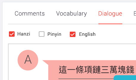
Actually, to follow on from my comment, I like using the “expansion” and “grammar” sections of each lesson to improve my listening. At the moment you can hide the pinyin and translation by default, but another option to hide the chinese text would also be great, so I can’t ‘cheat’ by glancing at the text before the audio is played and thus ruin my chance of successfully listening to the audio and figuring out what is being said. Thanks

1 Like

I second that “hide text” option idea. I use those sections in the same way, and often accidently see parts of the sentence

Thanks. We have added this suggestion to the development board. Something like this?

1 Like

I just want to say, I came to ChinesePod.com a couple of days ago to find the new design. So far, I am loving it! It finally feels like a modern website instead of something left over from the last decade. The site not only loads much faster, but filtering lessons by level actually works! Thanks for the great job, it has renewed my commitment to improve my Chinese! :smiley:

2 Likes

Hi Gwilym, yep something like that where you can untick all (hanzi, pinyin and english) and just get a play button to hear the audio would be great. Ta!

Thanks for the compliments. At the moment it is mainly just a visual upgrade, but we’re hoping to roll out some under the hood improvements as well as added functionality soon. Also, keep an eye on the new apps which are also under active development.

1 Like

The following would be very much appreciated!

  • Floating audio/video player that scrolls down page

  • Custom user playlists

Thanks for all your hard work on the website. I recommend Chinese Pod to anyone who will listen (and some who won’t).

Agree. Today found the new red background with white characters while mousing around! It makes it a lot easier to check meanings. xie xie ni.

1 Like